
Welcome to the official documentation page for the Nasio Blocks plugin.
Table of Contents
- Installation
- Configuration
- Template Library
- Nasio blocks
Installation
To be able to use the plugin, you need to have a self-hosted WordPress installation, running php >= 7.2 and WordPress >=6.7. For hosting, we recommend you to use the service from our partners HostArmada but any php/mysql hosting provider should also work. It is recommended that you use php 7.4 or above and the latest version of WordPress.
- In your admin panel, go to Plugins and click the ‘Add New Plugin’ button.
- Type in Nasio Blocks in the search form and press the ‘Enter’ key on your keyboard. If you have purchased the pro version, you need to upload the .zip file provided by email. Go to Plugins -> Add New Plugin and then click “Upload Plugin” button to install the Nasio Blocks Pro plugin.
- Click on the ‘Activate’ button to use your new plugin right away. If you have purchased the pro version, you need to activate the Nasio Blocks Pro plugin You would also need to add the license key, which you have received by email.
Configuration
Navigate to Settings > Nasio Blocks in your admin panel to configure the plugin options. You will see a screen that allows you to enable or disable specific blocks:
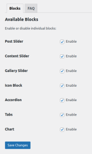
The plugin is very lightweight and the site will run fast with all blocks in place, however, if you do not plan to use a specific block, you can disable it for maximum efficiency.
Template Library
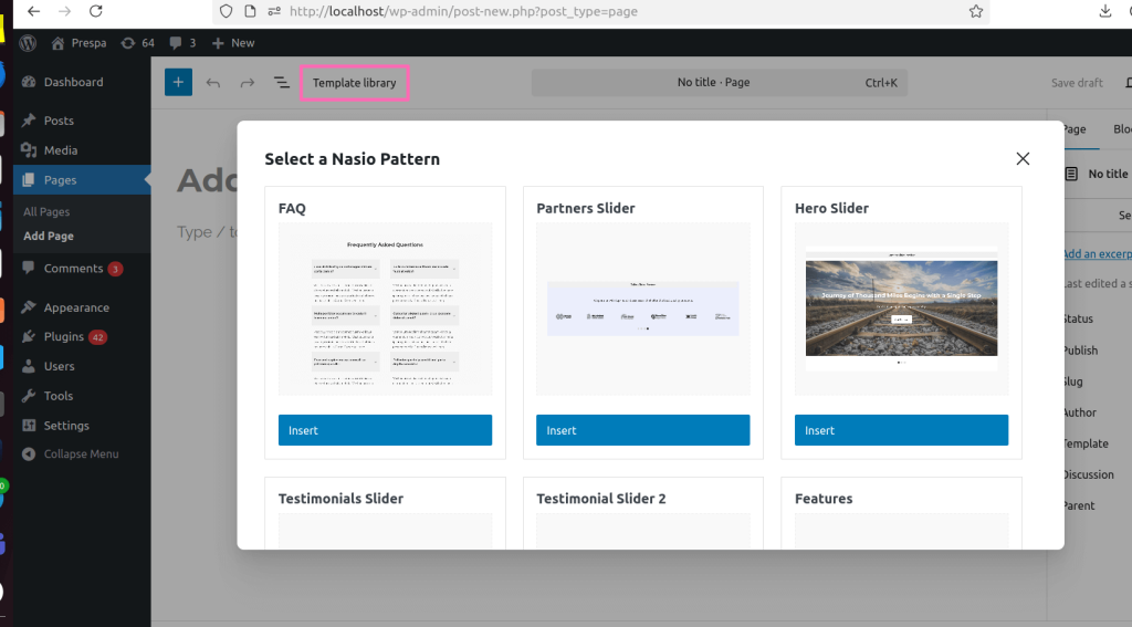
The template library is an extremely powerful feature of this plugin that lets you add demo content to your site with a single click. In technical terms, the template library is a collection of Block patterns – a unique mixture of standard Gutenberg Blocks as well as the custom Gutenberg Blocks from Nasio Blocks plugin. With the help of the template library, you can kick-start your website with just a few clicks and without any technical knowledge. Just create a new page from your WordPress admin dashboard (page, add new page) and click on “Template Library” in the top left. You will be presented with a screen that lists all the patterns that the Nasio Blocks plugin registers. Just click on the pattern you want and it will appear on the page.
You can then customize the content the way you want it.
Nasio blocks
Nasio Blocks plugin registers 8 additional Gutenberg blocks – Post slider, Content Slider, Gallery slider, Tabs, Accordion, Chart, Countdown and Icon blocks. These are advanced Gutenberg blocks that work together with the default Gutenberg blocks provided with WordPress and aim to enrich the Block editor so you don’t need to use any additional page builders. However, if you really need a page builder like Elementor and it makes your life easier, it is still possible to use it in combination with the Nasio Blocks plugin. We will now explore the options of each of the blocks provided by the plugin and learn how to customize them.
Post Slider block
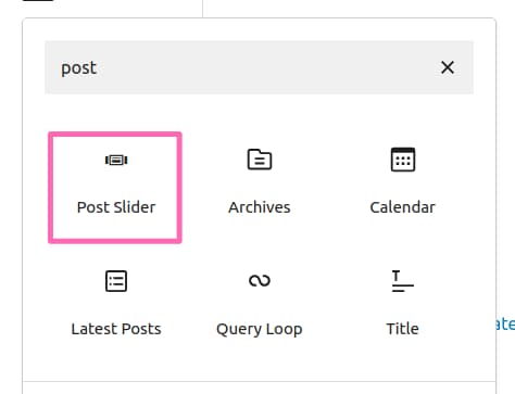
Display your blog posts in beautiful, fully-responsive carousel or a slider. To use the Post slider block, as well as with all other Gutenberg Blocks, you need to access the WordPress Block editor (also called Gutenberg). Both terms are interchangeable but for simplicity we are going to refer to it as the Block editor in this documentation. From the WordPress admin dashboard, go to Pages, and click on “Add Page” or click on Pages, hover on an existing page and click on “Edit”. Now that you are on the Block editor screen, simply click on the plus icon to insert a block and start creating content. To use the post slider block, simply type “post slider” in the search bar of the block inserter popup and click on it.
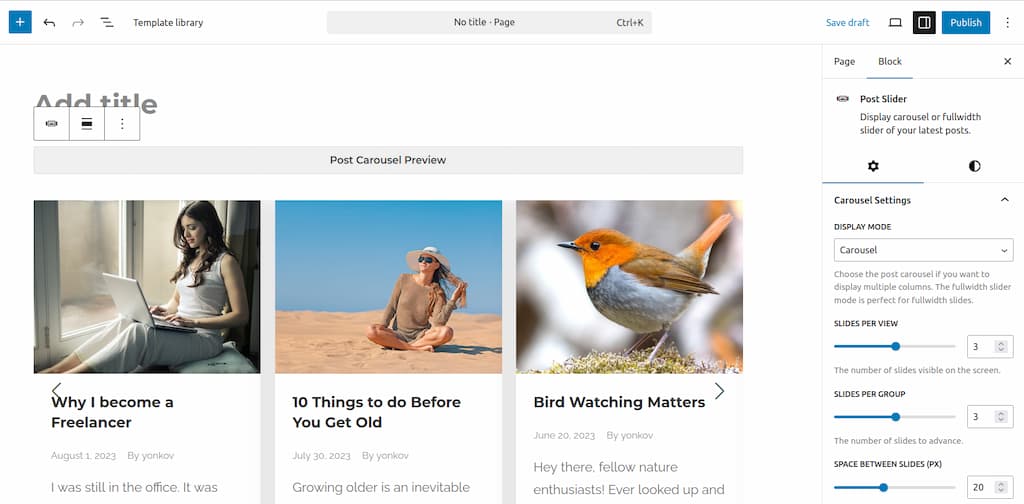
By default, the post slider will get your last 6 blog posts and display them in a 3-column layout but you can configure it easily to change the number of columns and the number of posts to loop through. To use the block, make sure you have some blog posts already created. You can check that by clicking on Posts in the WordPress admin dashboard on the left hand side of the screen. The customization options for the Post slider block can be found in the block settings tab on the right hand side of the screen. If for some reason you are not seeing them, make sure that the settings panel has been switched on.
The block settings are divided into three categories within a tab called “Settings”: carousel settings, post settings and display settings. There is also an additional tab called “Styles” that you can use to customize the colors of the slider elements. Here is a list with all the available customization options:
Settings
Carousel settings
- Display Mode – choose between slider (one-column layout per view) or carousel (multi-column layout per view)
- Slides Per View – Min 1, Max 5, Default 3. Choose how many slides per view should be displayed.
- Slides Per Group – The number of slides to advance when going through the slides. In 90% of the cases it is the same as the slides per View.
- Space Between Slides (px) – Min 0, Max 50px, Default 20px.
- Transition Effect – Only when Slider display mode is selected. Choose a transition effect when sliding. Effects: slide, fade ken burns, cell split, cube, coverflow, flip, creative, cards.
- Show Arrows – A toggle to switch the slider arrows (slider navigation) on or off.
- Arrow Offset (px) – Choose how to position the arrows relative to the slider. The option appears only when Show Arrows switch is on. Negative values move the arrows outside of the slide.
- Show Dots -A toggle to switch the slider dots (slider pagination) on or off.
- Dots Position – Choose how to position the dots relative to the slider. The option appears only when Show Dots switch is on. Options: Bottom inside, Bottom outside (default), Left, Right.
- Drag Slides – drag the slides with the left click of your mouse.
- Slide on Scrollwheel – premium feature. Slide while scrolling down the page.
- Loop Carousel – Allow the slider to start from the beginning after it finishes.
- Autoplay – Let the slider advance automatically.
- Autoplay Delay (ms) Min 1,000, Max 10,000, Default 3,000. The option appears only when the Autoplay switch is on.
Post settings
- Post Type – premium feature. Choose the source for the slides. Can be posts or any custom post type registered on the site, e.g. Projects, Books or Movies.
- Number of Posts – Min 2, Max 20, Default 6.
- Category – a dropdown with all post categories. It allows you to filter the content of your post slider to display only specific blog posts. If you have selected a custom post type in the Post Type setting and it has custom taxonomies assigned to it, you will see a dropdown with the items from that taxonomy.
- Include Sticky Post – you can add a sticky post to your slider.
Display Settings
- Show Post Featured Image
- Show Post Fallback Image
- Show Post Excerpt
- Show Post Author
- Show Post Date
Styles
Arrows Colors
- Arrows Color
- Arrows Background color
Dots Colors
- Dots color
- Active Dot color
Content Slider block
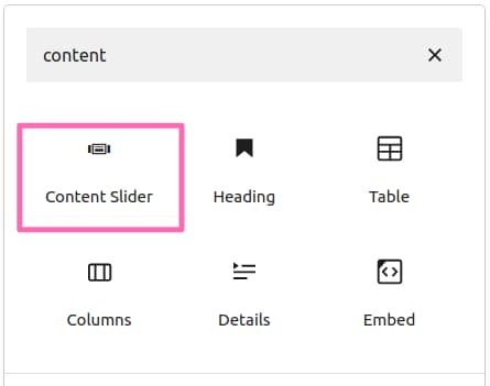
Create content in beautiful, fully-responsive carousel or a slider. To use the Content slider block, you need to open the Block editor. Navigate to the WordPress admin dashboard, go to Pages, and click on “Add Page” or click on Pages, hover on an existing page and click on “Edit”. Now that you are on the Block editor screen, simply click on the plus icon to insert a block, type “content slider” in the search bar of the block inserter popup and click on it.
By default, the Content slider will consist of 6 slides in a 3-column layout per view but you can configure it easily to change the number of slides to loop through. To do that, select the Content slider block, click on document overview icon in the top left, hover on the last slide, select the three dots on the right and click on duplicate.
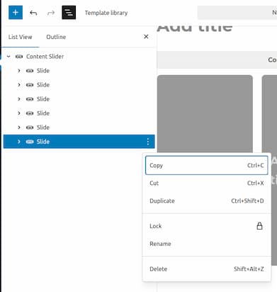
You can use the above-mentioned approach to delete or edit a slide or you can simply click directly on the slide you want to delete or edit. To add background image to a slide, select the slide and click on “Add media”.
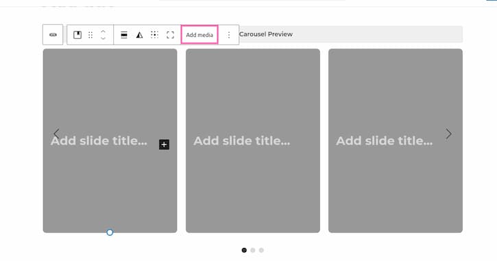
To add content to the slide, e.g. text or buttons, click on the plus icon and pick a Gutenberg block of choice.
The block settings are divided into two tabs called Settings and Styles. It is important to note that there are different settings and styles options if you select the the Cover block within each slide or the whole Content slider block. The options of the Cover block are core Gutenberg functionality. For refreshment on it, check the Cover block documentation. Our focus here are the options for the Content slider block, which are specific for the Nasio Blocks plugin.
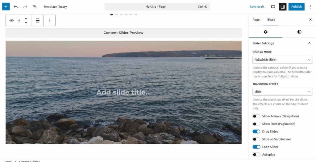
Settings
- Display Mode – choose between slider (one-column layout per view) or carousel (multi-column layout per view)
- Slides Per View – Min 1, Max 5, Default 3. Choose how many slides per view should be displayed.
- Slides Per Group – The number of slides to advance when going through the slides. In 90% of the cases it is the same as the slides per View.
- Space Between Slides (px) – Min 0, Max 50px, Default 20px.
- Transition Effect – Only when Slider display mode is selected. Choose a transition effect when sliding. Effects: slide, fade ken burns, cell split, cube, coverflow, flip, creative, cards.
- Show Arrows – A toggle to switch the slider arrows (slider navigation) on or off.
- Arrow Offset (px) – Choose how to position the arrows relative to the slider. The option appears only when Show Arrows switch is on. Negative values move the arrows outside of the slide.
- Show Dots -A toggle to switch the slider dots (slider pagination) on or off.
- Dots Position – Choose how to position the dots relative to the slider. The option appears only when Show Dots switch is on. Options: Bottom inside, Bottom outside (default), Left, Right.
- Drag Slides – drag the slides with the left click of your mouse.
- Slide on Scrollwheel – premium feature. Slide while scrolling down the page.
- Loop Carousel – Allow the slider to start from the beginning after it finishes.
- Autoplay – Let the slider advance automatically.
- Autoplay Delay (ms) Min 1,000, Max 10,000, Default 3,000. The option appears only when the Autoplay switch is on.
Styles
Arrows Colors
- Arrows Color
- Arrows Background color
Dots Colors
- Dots color
- Active Dot color
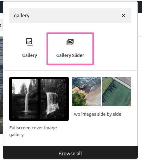
Gallery Slider Block
The Gallery slider block lets you add an image gallery and display it in a slider. In the WordPress Block editor click on “Add block” plus sign and type “gallery slider” in the block inserter popup.
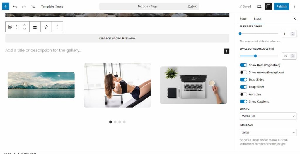
After that, upload the images of choice. By default, the Gallery slider block displays 3 slides per view and the slide step is one slide at a time but you can change those in the Gallery Slider settings.
Settings
- Slides Per View – Min 1, Max 5, Default 3. Choose how many slides per view should be displayed.
- Slides Per Group – The number of slides to advance when going through the slides. In 90% of the cases it is the same as the slides per View.
- Space Between Slides (px) – Min 0, Max 50px, Default 20px.
- Show Arrows – A toggle to switch the slider arrows (slider navigation) on or off.
- Arrow Offset (px) – Choose how to position the arrows relative to the slider. The option appears only when Show Arrows switch is on. Negative values move the arrows outside of the slide.
- Show Dots -A toggle to switch the slider dots (slider pagination) on or off.
- Drag Slides – drag the slides with the left click of your mouse.
- Loop Carousel – Allow the slider to start from the beginning after it finishes.
- Autoplay – Let the slider advance automatically.
- Autoplay Delay (ms) Min 1,000, Max 10,000, Default 3,000. The option appears only when the Autoplay switch is on.
- Show Captions – Display image caption.
- Image link – none, media file, attachment page.
- Image size – thumbnail, large, medium, full size, custom dimentions (px or rem).
Styles
Arrows Colors
- Arrows Color
- Arrows Background color
Dots Colors
- Dots color
- Active Dot color
Accordion block
The Accordion block is perfect for displaying collapsible content, e.g. frequently asked questions or items that require explanation that can be hidden by default and opened on tab click. The Accordion block is accessible via the WordPress Block editor and you can call it in the exact same way as with the other Gutenberg blocks.
The accordion settings consist of two tabs (accordion settings and styles)
The settings should be visible in the right panel. Make sure you have selected the Accordion Block and not an Accordion Item because these are technically two different blocks and the item itself does not have any settings, it is just a placeholder for adding text. To make sure you have selected the correct block, use the Document overview button in the top right of the Block editor screen.
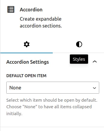
Accordion Settings
- Default open item – Choose an accordion item that should be initially expanded on page load. You can either choose an item to remain open on every page load or pick “None”, if you wish all accordion items to be collapsed by default.
Styles
- paddings – Control the padding of the Accordion block.
- margins – Control the margin of the Accordion block.
- header background color – Change the background color of the accordion item titles.
- header text color – Change the text color of the accordion item titles.
The accordion block consists of multiple accordion items and each of the items have Accordion item header and Accordion item content. You can also add Gutenberg blocks like icons and images to the Accordion item content. Adding Gutenberg blocks to the Accordion item header is a premium feature.
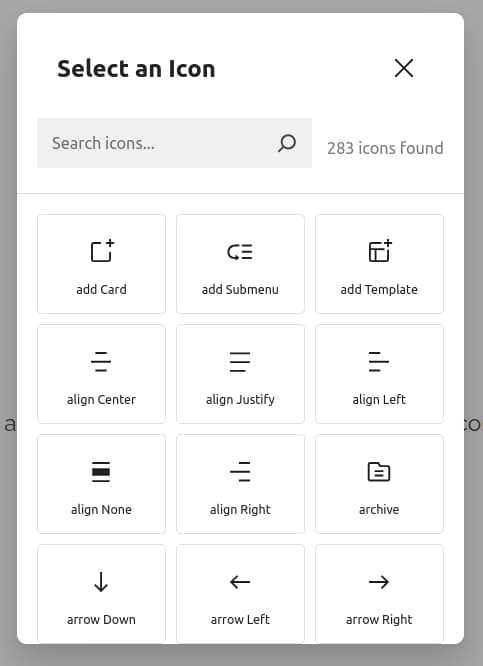
Icon block
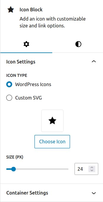
The icon block lets you display svg icons in the WordPress Block editor. You can choose between more than 250 icons from the WordPress icons library or you can also upload custom svg icons. As with the other Nasio blocks, the block options are displayed in two tabs: Settings and Styles.
When you click on the “Chose icon” button, a popup will appear that lets you select an icon.
Icon Settings
- Icon type – WordPress icons or custom svg icon.
- Size (px) – Min 12px, Max 120px. Default 24px. The size of the svg icon.
- Container settings – premium feature. Control the background size, width, height and border radius of the svg container to add a background shape to the svg.
Styles
- Text color – Change the color of the svg icon.
- Background color – Change the background color of the svg container.
- padding
- margin
Tabs block
The Tabs block lets you organize content into tabs. As with all the other Nasio Blocks, the options are divided into two tabs: Settings and Styles. To access the block options, make sure you have selected the Tabs block in the WordPress block editor. We recommend using the Document overview button in the top left side of the screen for a clear overview of all the blocks in a page. It makes correct block selection way easier compared to a mouse click.
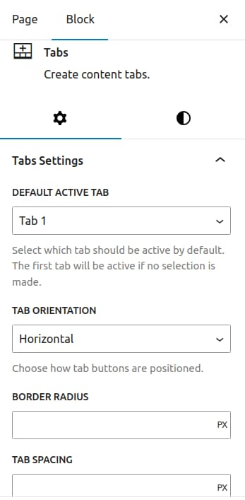
Tabs Settings
- Default Active Tab – Choose which tab item should be active on page load.
- Tab Orientation – Premium feature. Choose between horizontal or vertical display for the tab buttons.
- Border radius – Premium feature. Round the tab buttons to fit the layout of the theme.
- Tab spacing – Premium feature. Add spacings between the tab buttons.
- Tab width – Premium feature. Full width or fit content.
Styles
- Tab buttons styles – Default (buttons), Text Underlines or Pills.
- padding
- margin
- Tab title background color
- Tab title text color
- Active tab title background color
- Active tab title text color
Chart Block
The chart block lets you visualize data in the form of beautiful pie charts, bar charts, line charts or doughnut charts. Once you select a chart, it comes predefined with some dummy chart data for an easier start with the block:
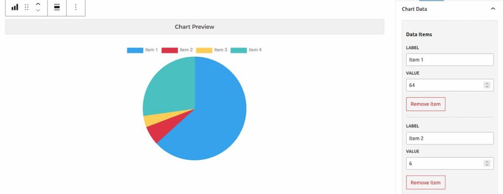
The default data items in the chart legend are Item1, Item2, Item3 and Item4 but you can rename, remove and add as many data items as you want. You can also easily change the legend position, colors of the data items and add a data unit, e.g. percentage. cm, currency symbol, etc. If you select bar or line chart, you can even add additional datasets to compare the data items between datasets.
The chart options are organized between two tabs – Chart Settings and Styles.
Settings
Chart Settings
- Chart type – Pie, Doughnut, Line, Bar. Default: Pie chart.
- Chart Title – Add chart title.
- Show legend – A toggle to switch the chart legend with the labels / datasets on or off.
- Legend Position – Top, bottom, left and right. Default: Top. The option appears only when Show legend switch is on.
- Legend Type – Premium feature. Rectangular or circle. Default is rectangular. The option appears only when Show legend switch is on.
- Disable Legend Click – A toggle to disable / enable hiding labels or datasets when clicking on legend items. The option appears only when Show legend switch is on.
- Show Labels – For pie and doughnut charts only. Display data values directly on the chart segments. Default is off, which means data values are visible only when you hover on the segment with the label.
- Chart Width (px)
- Chart Height (px)
- Chart Border radius
- Data unit – add data prefix / suffix, e.g. %, cm³, km/h, $, etc.
Chart Data
- Label 1, Laber 2, etc. – Change the name of the label. Default label names (Item 1, Item 2, etc.).
- Add label – Option to add additonal labels.
Datasets
For bar and line charts only.
- Dataset Label – name of the dataset that will appear in the chart legend for bar and line charts.
- Values – the values for each label. To change the label name, you need to go to the Chart Data section.
- Add Dataset – a button that allows you to add more than one dataset to compare data to.
Styles
Chart Colors
- Item 1 color, Item 2 color, etc. – Change the color of the data segments. Please note the label names are dynamic, item 1 and item 2 are default placeholders.
Background & Border
- Background color – Change chart background color.
- Border color – Change chart outer border color.